
Key Take Aways
In this article, we’ll take a closer look at how to create a report in Power BI Service, a cloud-based solution. You’ll see how to import data, create and edit reports, and build dashboards with your Power BI reports.
What is Microsoft Power BI?
Power BI is a business intelligence solution from Microsoft that allows users to create dynamic reports and dashboards with little effort. It helps teams uncover actionable insights hidden in any data source.
If you’re new to Power BI, check out our guide on Getting started with Power BI for a foundational overview.
Getting Started with Power BI Reports
This article covers how to build reports, import data, and build dashboards in Power BI service, a cloud-based solution. Although Power BI is designed for users rather than report designers, it’s a valuable tool for project reporting.
We’ll also briefly look at Power BI Desktop, the primary authoring tool for Power BI reports. A full exploration of Power BI Desktop isn’t covered here, but you’ll find additional training resources and videos listed at the end of the article if you want to explore further.
The examples in this article are based on Microsoft samples and project reports in the BrightWork Power BI Pack.
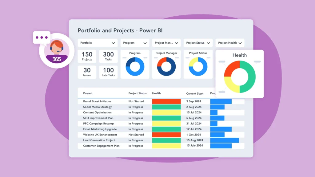
Project management on Microsoft 365
Watch a demo of BrightWork 365 project and portfolio management templates for Microsoft 365, Power Platform, and Teams.
Key Features of Power BI Reporting
Microsoft Power BI is a collection of software services, apps, and connectors that help turn raw data into clear, interactive insights.
Before creating your first Power BI report, it’s important to know which services handle import, transformation, and visualizations. Some features are available only on desktop applications, which is something to keep in mind as you get started.
Power BI Visualizations
Power BI brings data to life with dynamic, easy-to-understand visuals. These clear visuals help turn data into stories that support better business decisions. Built-in chart options include area charts, bar charts, column charts, and cards.
For even more options, visit Microsoft AppSource. Some recently added visualizations include:
Valq Plan – A no-code solution for building complex business plans, scenarios, and simulations.
Date Picker by Powerviz – A modern, interactive calendar view.
Drill Down Network PRO – Helps visualize categorical data and automatically detect relationships based on category structure.
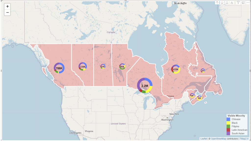
TMap 2.1 – Allows you to drill down into chart maps by georegion names.
Power Query – Desktop
Power Query is the engine for importing and transforming (cleaning) data before loading it into your report. The Power Query editor provides an interface for applying transformations.
Options include:
Add or remove rows and columns
Separate rows or columns
Remove null values
Remove rows with blank values.
Data Sources and Connectors
Changes applied in the Power Query editor do not impact the original dataset. Power Query uses connectors as data sources. Some recently updated connectors include:
Snowflake
Planview OKR
BitSight Security Ratings
Starburst Enterprise
And others
You can view the full list of all connectors and data sources, including SQL databases (such as Azure SQL, MySQL, etc.), Excel spreadsheets, and cloud services.
Power Pivot – Desktop
Power Pivot builds data models, defines relationships between tables, and performs calculations. It uses Data Analysis Expressions (DAX) to analyze data, similar to Excel functions.
Power BI includes over 600 DAX functions, including SUM, AVERAGE, MAX, and COUNT. Users can also create custom functions.
OneDrive and SharePoint Integration – Desktop
Viewing Power BI files directly within OneDrive for Business and SharePoint allows users to streamline collaboration.
A Power BI report on SharePoint is easy to share and manage within teams. The public view is enabled by default but can be disabled by Power BI admins.
Once you’ve clicked on the Power BI file, it opens immediately in your browser without any need to download it.
Power BI Reports – Desktop and Service
A Power BI report consists of multiple visuals and can span multiple pages. Reports connect to a single dataset or data model only, but Power BI can pull information from multiple data sources into one report.
Unlike an Excel spreadsheet, Power BI reports are interactive. You can filter, slice, and drill down into data.
Automatic refresh updates all visuals in a report at set intervals, such as every hour or when data changes.
Power BI Dashboards – Service
A Power BI dashboard is a one-page summary made up of visual tiles. Each tile links to a report, allowing quick access to more details as needed.
A dashboard can contain links to multiple reports, giving you a full overview in one place. This feature is only available in the Power BI Service.
Data Model Editing – Service
Since August 2023, Power BI Service has allowed direct data model modifications.
There’s no need to switch to Power BI Desktop to make changes and republish. It also allows project teams to collaborate on the same data model simultaneously.
Model Explorer makes it easy to view and navigate all semantic objects within a dataset.
Differences Between Power BI Desktop and Power BI Service
At this point, you may be wondering if you should create and edit reports in the Power BI Desktop version or Power BI Service.
Why Use Power BI Desktop?
Power BI Desktop is the best choice when you need to create project reports from scratch. Using this application is best for:
Building project reports with data import, transformation, and modeling.
On-page interaction for direct visual formatting.
Tracking all activities in one place.
Working with Power BI Desktop takes some practice. A good understanding of the Query Editor and Model tools is important before creating any visualizations.
If you are using a clean dataset and need to create reports and dashboards to share with your team, Power BI Service is the right tool.
Here’s a quick comparison of the Power BI Desktop application and Power BI Service to help you decide.
How to Create a Report in Power BI Service
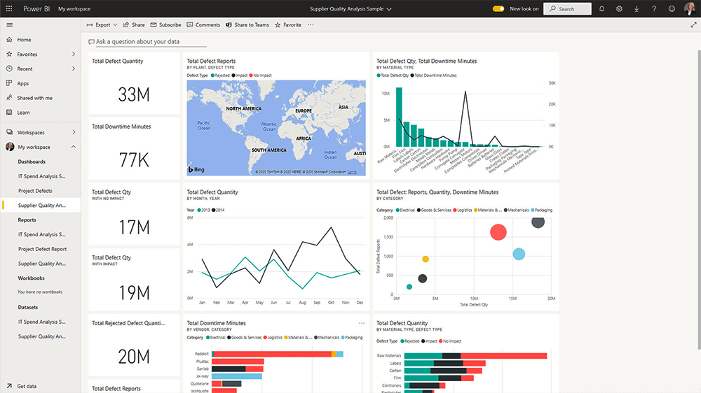
This section explains how to create a Power BI report and a dashboard in Power BI Service using Microsoft’s free Supplier Quality Analysis sample.
1. Import Data
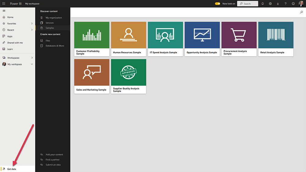
Start by getting your data into Power BI. You can import data from within your organization, such as file directories and databases.
You can also copy and paste data from an existing dataset. Go to the Samples section and choose a pre-configured dataset. The data is imported as-is with no editing options.
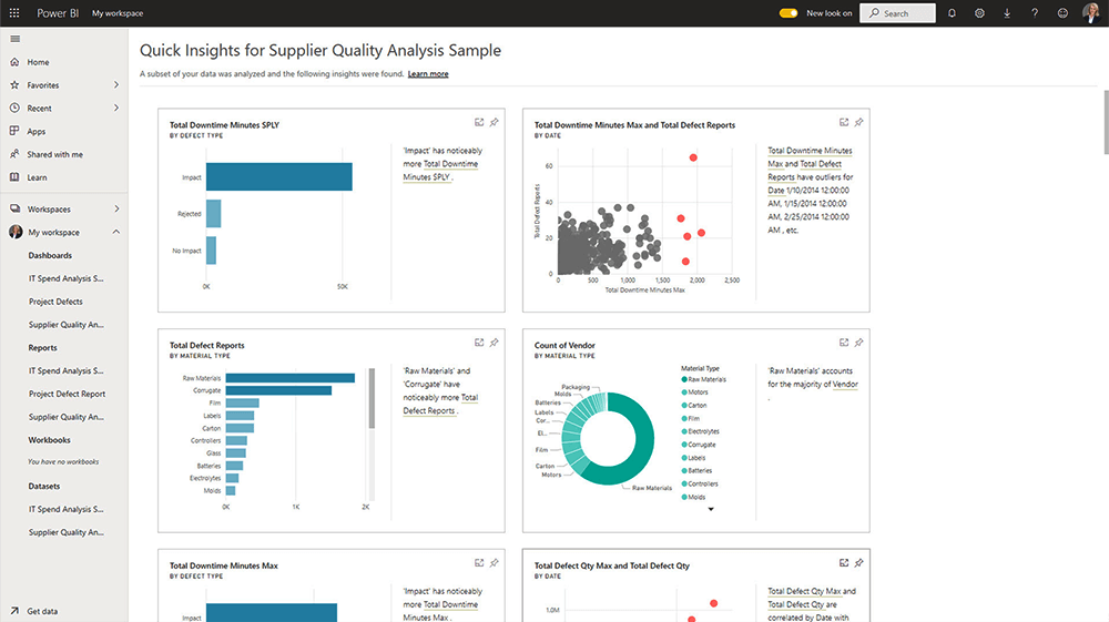
2. Access Your Workspace
The dataset will appear in your workspace in Power BI Service. Click ‘Get Quick Insights’ from the menu to generate a dashboard while you work on the data.
In the workspace, you can also assign roles and permissions, such as Viewer, Contributor, Member, and Admin.
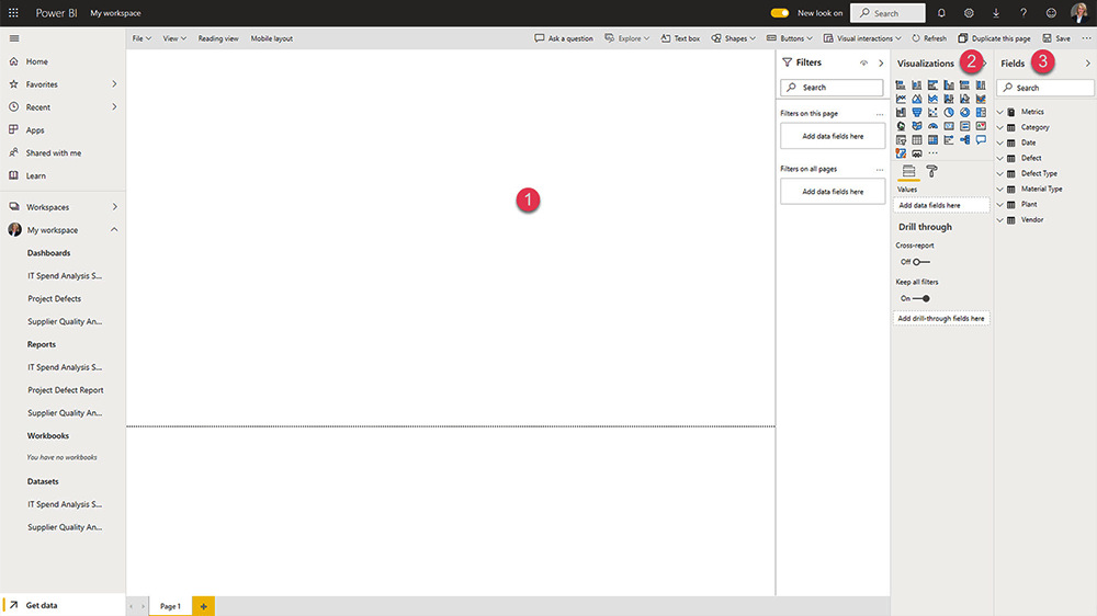
3. Open the Report Builder
Next, select ‘Create Report’ to open the report builder. There are three elements in this area:
Canvas – This area is blank until visuals are added
Visualizations Pane – Use to add and edit charts.
Fields Pane – A list of the fields in your dataset based on the columns in your dataset.
4. Add Data and Visualizations
Start building your report by selecting the relevant fields from your dataset or choosing a visualization. The selected chart will appear on the blank canvas.
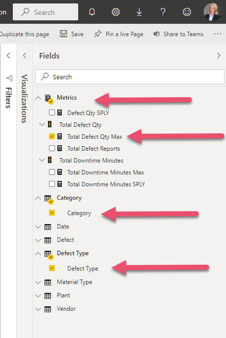
5. Add a Field
Click a field to add it to the report. Power BI will automatically add the field to the right area in your chart. You can also drag and drop fields into the axis, legend, and values area.
6. Change the Chart if Needed
Switch to a different visualization at any time using the Visualizations pane. Your data will adjust automatically to fit the new chart type.
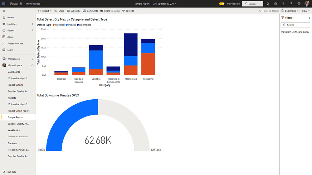
7. Format Your Report
Once you are happy with the data visualization, it’s time to format the chart. Click the ‘format’ icon to adjust the size, colors, borders, and tooltips of your chart.
If you’d like to add a title or details to the report, click the ‘Text box’ option in the top menu.
8. Preview the Report
Use the ‘Reading View’ to check how the report will appear to others.
9. Final Touches and Saving
Add more visualizations as needed, and remember to save your work. Use the ‘View’ menu to adjust the layout and colors for improved readability.
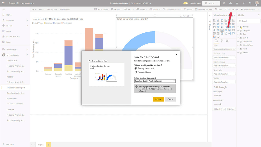
10. Create a Dashboard
Next, create a dashboard by selecting ‘Pin to a live page.’ You can add the report to an existing one or build a new dashboard. Add tiles and other content to customize it.
11. Export and Share
When you’ve finished your work, use the ‘File’ menu to:
Export reports to PowerPoint or as a PDF
Embed reports in a SharePoint site.
12. Share Your Report
To share your report, click ‘Share,’ complete the form, and share it with your team. Power BI reports and dashboards may be shared with internal and external users.
That’s it – you’ve taken your first step in creating reports in Power BI Services.
BrightWork 365 and Power BI
BrightWork 365 is built on Power Platform and uses Power BI and Power Automate as follows:
Microsoft Dataverse serves as the data platform and supports business process management, such as stage-gate project lifecycles.
Power BI gives senior executives and PMO leads visibility into portfolios, programs, and projects.
Using connectors and content packs, data can be pulled from hundreds of on-premises and cloud sources into a single reporting engine.
See How BrightWork 365 Enhances Power BI Reporting
Power BI Service is an easy and effective way to create interactive reports and dashboards. You can import Excel files, connect to cloud data, and customize visuals to analyze and share insights with your team quickly.
To build your skills and stay current, explore the learning resources on Microsoft Learn and connect with others in the Microsoft Fabric Community.
BrightWork 365 combines Microsoft 365 tools with proven project and portfolio management practices. It helps teams plan, track, and deliver work more efficiently.
See it in action and discover how it can support your organization. Watch the BrightWork 365 Video Tour.
Resources and Videos
Desktop to Dashboard in 60 Minutes (Avi Singh, Microsoft MVP)
Microsoft Power BI Samples
Power BI Documentation
Clean, transform, and load data in Power BI (Free Microsoft Training Module)
Editor’s Note: This post was originally published in September 2020 and has been updated for freshness, accuracy, and comprehensiveness.