
Introduction
I recently read that ~1.145 trillion MB of data is created per day as of 2025.
Whilst that number is astonishing in itself, I was struck by another thought: how much data do we consume and process every day?
At work, how much time do we spend gathering data from multiple sources before trying to glean some useful insights from these mismatched sources?
As project managers, the answer is simple – too much time! Tasks, budgets, risks, issues, resources; every element of a project generates data that should be tracked and analyzed.
Key Takeaways
-
Power BI Simplifies Data Analysis for Everyone
Power BI enables users—regardless of technical background—to transform complex data into interactive visualizations and actionable insights, making it ideal for project managers and business users. -
Core Components Support the Full Data Lifecycle
Key tools include Power Query (data transformation), Power Pivot (data modeling with DAX), Power View (visualization), and Power Q&A (natural language queries). Reports and dashboards help users explore and share insights effectively. -
Desktop vs. Cloud-Based Service
Power BI Desktop is used for creating and publishing reports, while Power BI Service allows users to view, interact with, and collaborate on dashboards online. Enterprise users can also leverage Power BI Report Server for on-premises needs. -
Project Management Benefits
Power BI enhances project visibility by tracking timelines, resources, risks, and performance metrics in real-time dashboards. BrightWork’s Power BI Pack offers pre-built templates tailored for project and portfolio reporting. -
Getting Started is Easy and Scalable
Users can begin with free tools and training resources, then scale up with BrightWork 365 integrations and Microsoft Fabric for enterprise-level analytics and automation.
Transforming Project Analytics
Without business intelligence software or a background in statistics, delivering reliable, actionable insights to drive projects forward is a daunting task. This is the perfect scenario to get started with Microsoft Data Analytics.
That’s where Power BI comes in. It enables anyone to collect and analyze data, transforming it into engaging visualizations without needing coding or statistical expertise.
This guide covers the basics of Power BI, including key concepts, Power BI Desktop, and Power BI Service, making your initial Power BI getting-started experience a smooth one.
What is Microsoft Power BI?
Microsoft defines Power BI as a collection of software services, apps, and connectors that transform unrelated sources of data into coherent, visually immersive, and interactive insights. It imports data from multiple sources, including SharePoint and Excel.
End-users can easily generate rich reports and dashboards from that data and share these reports with their team. The goal is to find, surface, and act on business insights.
Power BI is part of the Microsoft Power Platform, completing the task of ‘Analyze’ within the ‘Analyze, Act, Automate’ approach. Many users find that after mastering data analysis in Power BI, getting started with Microsoft Power Automate is a logical next step to automate workflows based on their data insights.
Key Power BI Components Explained
As mentioned above, Power BI is a collection of services and apps.
The platform is available in three formats:
-
Power BI Desktop – Used to create and share reports.
-
Power BI Service – Used to view reports online.
-
Power BI Mobile Apps – Used to access reports and dashboards on Windows, iOS, and Android.
There are two main end-user roles for Power BI:
Consumer or user – An individual who uses Power BI Service in a browser to view reports and complete light editing on datasets.
Designer – An individual, often a business analyst, who creates and shares reports using Power BI Desktop.
We’ll review the desktop and cloud offerings further below.
Power BI relies on numerous services to import and transform data and create visualizations.
If you use Excel, you will be familiar with many of these concepts and services. However, Power BI can handle larger datasets than Excel and provides a wider range of visualizations.
Power Query for Data Transformation
Power Query is the engine for importing data and transforming (cleaning) data for processing.
Data is imported through a simple interface and transformed using the ‘Power Query’ editor.
Power Pivot for Data Modeling
Power Pivot is used for creating data models, which involve relationships between tables, and performing calculations.
Calculations use DAX – Data Analysis Expressions – to interrogate data. DAX statements are similar to Excel functions. Power BI includes over 200 DAX functions such as sum, average, max, and count.
Power View for Data Visualization
Power View delivers data visualization in various Microsoft applications, including Power BI, SharePoint, and Excel.
In addition to out-of-the-box visualizations such as bar charts, Gantt charts, KPIs, and tables, additional visualizations are available in AppSource.
Reports and Dashboards in Power BI
Visualizations are used in both reports and dashboards in Power BI.
A Power BI report refers to a collection of visuals and can span multiple pages. Reports connect to one dataset or data model only.
In contrast, a Power BI dashboard is a one-page summary of your data, with visualizations (tiles pinned to the dashboard by the report designer). You can create your own or use pre-configured Power BI dashboards to get started faster.
Each tile links to an underlying report, making it easy to drill down for more detail as needed. A dashboard can contain links to multiple reports, providing a high-level view of your data in one place.
Power Map for Geospatial Data
This is a useful way to display geospatial data, for example, office locations, on an interactive map.
Power Map for Geospatial Data
Power Q&A for Natural Language Queries
office locations, on an interactive map.
Powered by AI, users can simply type questions about their data in the Power BI interface (Power BI Service)
Uses and Benefits of Power BI
The use cases of Power BI depend on organizational requirements. With its global adoption, you’ll find communities and resources in many languages, with users searching for terms like ‘reportes en Power BI’ in Spanish or ‘dalam Power BI’ in Indonesian.
-
Enables data analysis with connections to multiple data sources.
-
Allows users to combine these data sources into a single report for in-depth insights.
-
Generates engaging, interactive visualizations with a few clicks.
-
Allows users to filter data and create personalized views without changing the underlying dataset.
-
Facilities collaboration with comments and sharing.
Power BI for Project Management
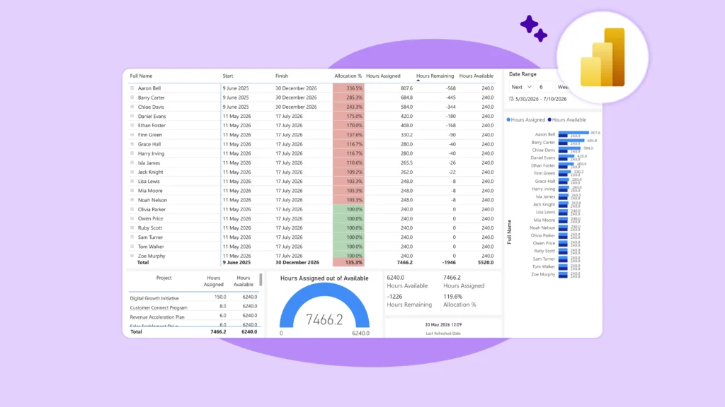
In the context of project management, Power BI simplifies and enhances 7 benefits of project reporting for managers, teams, and senior executives.
Instead of searching through sites, emails, and spreadsheets, the project team can easily track performance in real-time dashboards.
Power BI dashboards give senior managers and PMOs leads visibility into:
-
Current projects within the organization.
-
Portfolio timeline with filters for year, quarter, month, week, and day.
-
Resource allocation, including project managers.
-
Key project metrics.
-
Overdue projects.
-
Risks and Issues.
A portfolio Gantt chart with BrightWork and Power BI
Similarly, project managers can track:
The project timeline
Active items and tasks
Project status reports
Issues and risks.
Power BI Desktop
Power BI Desktop is a free application that installs directly onto your computer, making it easy for new users to get started. You can download from Microsoft or within Power BI Service.
Think of the application as an authoring tool, used to create and publish reports. Designers use Power BI Desktop to import, transform, analyze, and visualize data using the components outlined in the previous section.
Power BI Desktop has three main views:
-
Report – Build reports and visuals. This page remains blank until the first visualization is added.
-
Data – Transform data using Query Editor.
-
Model – Build relationships between tables with a drag-and-drop interface.
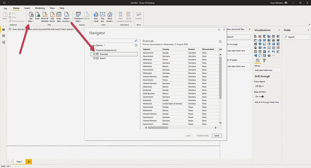
Preparing Your Data with Power Query
Before you can create visualizations, you must first connect to and prepare your data. Using the Power Query Editor in Power BI Desktop, you can transform data to meet your needs. This process, often called data shaping, involves several steps.
You can shape data by removing unnecessary columns or rows, changing data types (e.g., from text to number), and splitting columns. For more complex scenarios, you might need to combine data from multiple sources.
Power Query provides powerful tools to do this, such as the ability to merge queries that share a common column, similar to a SQL join, ensuring a clean and efficient dataset for analysis and data cleansing.
Building a Data Model
Once your data is clean, the next step is to build a data model. This happens in the Model view of Power BI Desktop. Here, you create relationships between your different data tables.
Defining the correct cardinality (e.g., one-to-one, one-to-many) for these relationships is important for accurate reporting. This collection of tables, relationships, and calculations forms your semantic model (the modern term for a Power BI dataset).
Within the model, you can also use DAX to create calculated columns that add new, derived information to your tables, such as concatenating a first and last name into a full name.
How to Build and Publish a Report
With a solid data model in place, you can start to build reports in Report view. Drag fields onto the canvas and use the visualizations pane to choose charts (bar, line, map, etc.).
After creating your visuals, publish to the Power BI Service. From there, it’s easy to share your work with colleagues and stakeholders, allowing them to view and interact with the report.
Using the Power BI Cloud-Based Service
Power BI Service is a cloud-based application for consumers who receive and interact with reports and dashboards. Users must have a license to access its features:
-
A free license allows users to work on personal reporting and visualizations in the ‘My Workspace’ area. Users can also view any reports shared with them.
-
A Power BI Pro license is required to publish content to other workspaces and share dashboards ($9.99 per user per month).
The platform organizes content into ‘workspaces’, which link to dashboards, reports, and datasets. It’s easy to find content quickly on the homepage. Add your favorite apps and workspaces, use ‘Recents’, or use the powerful Power BI search engine to find a dashboard.
Power BI Service supports light data editing and collaboration via comments on reports and dashboards. To import data, use the ‘Get Data’ to import data from your organization, online services such as SAP, files, and databases.
Note that if you opt to import local files, choose OneDrive or SharePoint as a source. Files stored locally will not update automatically.
Creating Your First Dashboard
One of the primary functions of the Power BI Service is to create a dashboard. Unlike multi-page reports, dashboards are single-page canvases that tell a story with important visualizations. The process starts with a report.
When you find a visual you want to highlight, you hover over it and click the pin visual icon. This action allows you to add the visual to a new or existing dashboard.
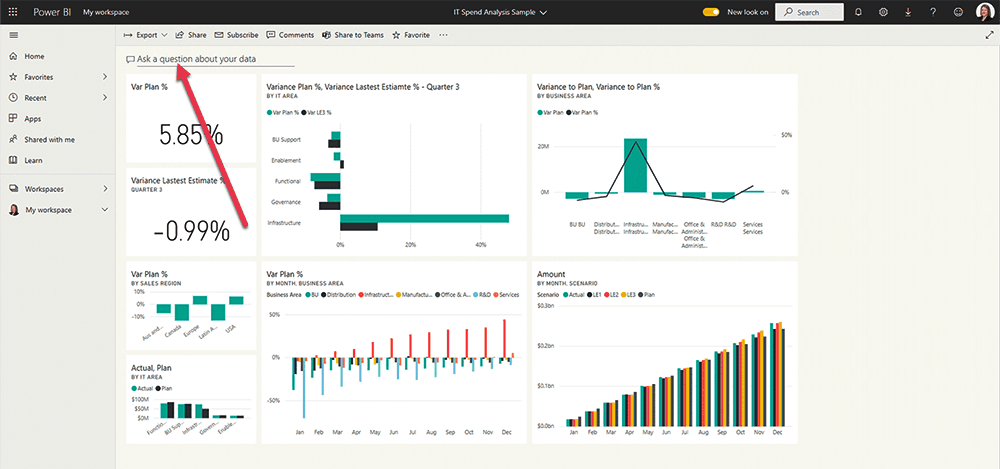
Each pinned visual appears on the dashboard as one of many tiles, which you can then resize and rearrange to create the perfect layout. You can also use the Q&A natural language feature directly on the dashboard to ask questions about your data and pin the resulting visual as a new tile.
Power BI for the Enterprise
While Power BI Desktop and Service are the most common components, enterprise environments often have additional requirements. For organizations that need to keep their data on-premises, Microsoft offers Power BI Report Server.
This solution provides on-premises reporting capabilities with a web portal where users can view and manage reports and KPIs. For specific formatting needs, such as invoices or operational reports, designers can create paginated reports, which offer pixel-perfect control over the layout.
Looking forward, Power BI is now a central part of Microsoft Fabric, an all-in-one analytics solution that integrates data engineering, data science, and business intelligence into a single, unified platform.
Simplifying Project Reporting with Brightwork 365
Microsoft Power BI empowers project teams to transform complex, scattered data into clear, actionable insights without requiring advanced technical skills.
BrightWork 365 builds on this foundation with tailored Power BI packs and integrated Microsoft 365 solutions that streamline reporting and collaboration across projects and portfolios.
If managing data and reporting feels overwhelming, BrightWork provides the expertise and tools to improve decision-making.
Your Next Steps with Power BI
Ready to take control of your project data? Contact us to discover how BrightWork can support your Power BI adoption and project management goals.
The free Power BI samples used in this article, along with practical training materials from Microsoft, are an easy way to simplify your analytics.