
Key Takeaways
This article will cover 5 ways you can use Power Apps dashboards to streamline reporting for project processes, including:
You will also learn how BrightWork 365 centralizes project tracking and reporting in one solution on the Power Platform.
-
Project requests
-
Projects
-
Issues
-
Risks
-
Costs and Budgets
Learn How Power Apps Dashboards Improves Project Reporting
Every project manager faces obstacles that can derail progress – from changing requirements to poor communication and limited visibility. These challenges often result in missed deadlines, budget overruns, and frustrated teams.
BrightWork 365, built on Microsoft 365, empowers organizations to overcome these barriers with structured workflows, automation, and real-time reporting. Let’s explore seven of the most common project management challenges and how BrightWork 365 helps you solve them.
To view this video, please allow Functional cookies.

What are Microsoft Power Apps?
Microsoft Power Apps is a low-code platform that allows users to create customized business applications without writing code. It is part of the Microsoft Power Platform, including Power BI and Power Automate.
With Microsoft Power Apps, you can create custom apps for various purposes, including project management, inventory tracking, and customer relationship management (CRM).
What is BrightWork 365?
BrightWork 365 is a project and portfolio management solution for Microsoft 365 and the Microsoft Power Platform.
It provides project management templates, dashboards and reports, as well as collaborative features to enable project teams to increase their project success rates.
BrightWork 365 is deployed in your Microsoft 365 cloud environment to centralize project processes and information in one hub. It integrates seamlessly across the following:
Microsoft Teams
Microsoft Apps (Word, Excel, and OneNote)
Power Apps
Power BI
Power Automate
SharePoint Online
5 Power Apps Dashboards for Project Reporting
Here are five ways you can use Power Apps dashboards to streamline reporting project management automation, including:
Project requests app dashboard
Projects app dashboard
Issues app dashboard
Risks app dashboard
Costs and Budgets app dashboard
Each dashboard offers unique benefits, as you’ll discover throughout this article and in the video above.
1. Project Request App Dashboards
Home
Requests
Projects
Portfolios
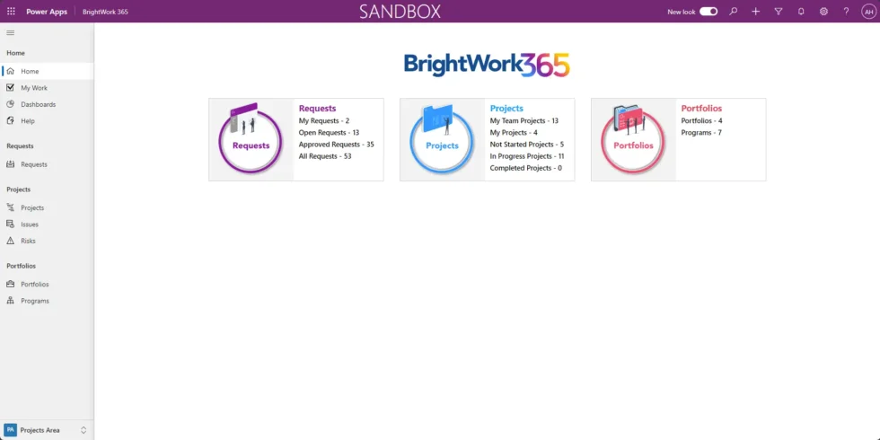
Click on Dashboards in the Home section to access the default Power Apps dashboards.
You can see here that the Requests Dashboard appears by default.
There are six dashboards on this page, and they are initially set to the “All Requests” view
If you select any of those drop-down menus, there are several other views available, including Open requests, Approved requests, etc.
In the Requests menu, click on Open Requests to view all current open requests logged in the system.
And if you click on the drop-down menu, you’ll see that all of those views are also available in the Requests area.
The charts visible in this view are the same ones featured in the Power Apps dashboard, allowing for seamless navigation between both.
For example, the Requests by Request Status data visualization is available in the dashboard.
You can expand this chart by clicking the pop-out icon in the right-hand corner to expand the chart into a lightbox view.
If you need more details, click the Project Created bar to see which project sponsors are linked to these requests.
You can see now that Jonathan, Anne, Christine, and Alan all have some projects created from requests.
These are the project sponsors supporting some of these requests, which have been developed into projects.
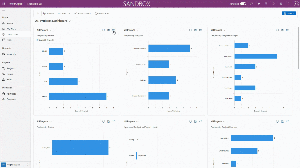
2. Project App Dashboards
For example, let’s focus on Projects by Health. You’ll notice four projects are marked as “Red.”
You may want to find out who the project managers are for these at-risk projects.
The next logical step is to understand which projects are in the red.
To see more details, click on the list icon in the top-right corner. This will filter the view to display only the four projects in danger
We’re in the All Projects view, but it has been filtered to just those four projects in danger.
If you’d like to dive deeper, click on any of these projects to view specific details in the BrightWork 365 app.
Now, you can identify that Eamonn, Anne, Alex, and Christine each have projects in a critical state.
3. Issues Dashboard
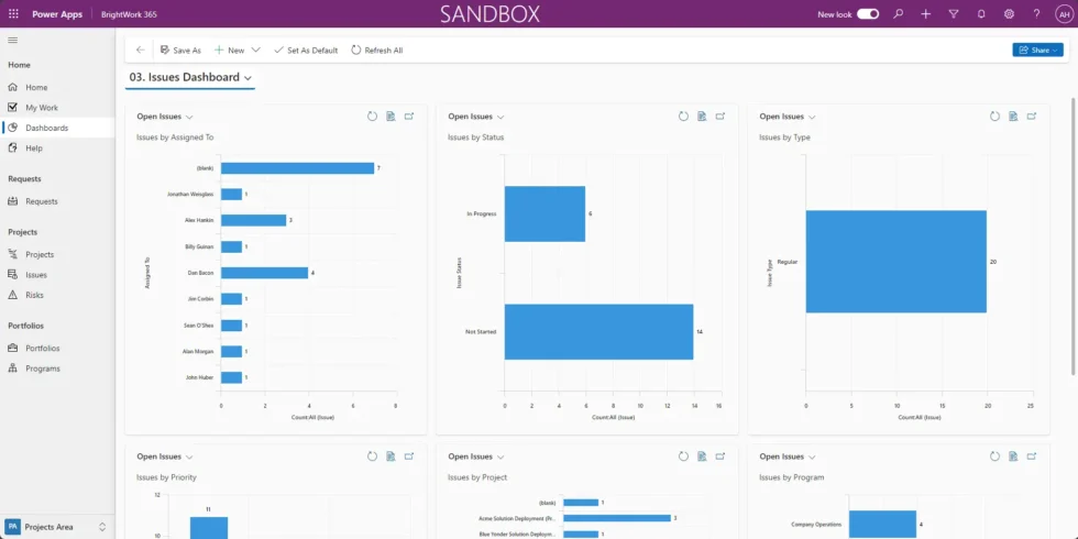
Now we’ll take a look at the Issues app dashboard.
In this example, we’ll focus on the “By Assigned To” chart. It shows a project with an unassigned issue.
In this case, it looks like we have seven. To identify which projects have unassigned issues and which they belong to, drill down on the project name.
The chart reveals six projects with unassigned issues.
Click the “View Records” icon to access the project list in BrightWork 365. From there, you can navigate to the project app and make the appropriate edits to assign that issue if needed.
3. Issues Dashboard
The Risks app dashboard works similarly to the Issues dashboard, with charts used to drill into data and extract details.
We’ll focus on two key charts: Risks by Escalation and Risks by Exposure.

5. Costs and Budgets App Dashboard
All project stakeholders recognize the importance of project budgets, so we have also included dashboards to help ensure projects stay within budget.
You can track project costs and even do some cost forecasting.
There are three sets of interactive dashboards: one for the project level, one for the program level, and one for the portfolio level.
Let’s start with the Project-level dashboards, which feature six visualizations.
The top three views focus on the approved budget, and the bottom three are cost forecast views.
These charts allow you to expand and drill down for more details.
For example, you can view how a project manager’s budget is allocated. Expanding the “Approved Budget by Project Manager” chart lets you focus on specific managers.
Let’s take a look at Alex’s projects.
This will pull up the chart showing where the budget is allocated across Alex’s projects.
The program and portfolio dashboards are very similar. All we’re doing is rolling these up to the program or portfolio level.
Data-Driven Efficiency on the Power Platform
Watch a recorded webinar about how you can optimize project reporting with Power Apps and Power BI.