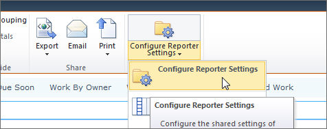
Click on the report you want to configure and click Configure Reporter Settings on the Reporter Tools ribbon.
Select the appropriate options (see below) and click OK.
This topic describes how to configure BrightWork Reporter Chart reports, including how to select the report you want to display.
|
Note: |
The Reporter Settings page will update dynamically depending on the report type selected. The reports supplied with BrightWork Reporter are setup to report on the lists supplied with BrightWork and SharePoint. If columns are added to these lists you can add these columns to reports using the Report Editor. This will enable reporting on these columns. Click here to learn how to add BrightWork Reporter to a BrightWork web part page. The Microsoft Chart Controls for Microsoft .NET Framework 3.5 must be installed and setup correctly for you to be able to use the Microsoft Chart Provider described in this topic. Failure to do this means that some charts may not render correctly. |
To configure a report:
Click on the report you want to configure and click Configure Reporter Settings on the Reporter Tools ribbon.
Select the appropriate options (see below) and click OK.
Select the report location and select or specify the report:
BrightWork Server Gallery
This is where the supplied BrightWork Reporter reports are stored.
BrightWork Reporter Library
This is where the reports you have created yourself are stored.
Custom Report Location
This is where you specify another location in the Report URL field that appears when you select this option, for example, the BrightWork Reporter Library on another site collection.
Select the Report Type:
|
Note: |
The Gantt and Resource Usage report types will only appear if valid data exists to render the report, for example, if only one date column exists a Gantt or Resource report cannot be rendered. |
Chart Report
Gantt Report
List Item Report
Resource Usage Report
Define the target site and specify whether or not to include the target site's subsites in the report
Current Site
Selecting this option means that only the current site will be included in the report.
Specified Site
This option is for specifying the SharePoint site to report off. Selecting this option enables the Specified Site field. The URL you supply must be server relative, for example: /sites/SiteName.
Specified Site(s)
This option is for specifying a list of SharePoint sites to report off. Selecting this option enables the Multiple Site Locations field for you to enter site URLs.
|
Note: |
Use a ; to separate the sites. The URLs can be server relative (for example: /sites/SiteName) or fully qualified (for example: http://www.contoso.com/sites/SiteName). Fully qualified URLs must point to sites on the same server as the site the report is running in. You can also specify a single site here - the Specified Site option above is being maintained for legacy reasons. |
Report XML
Selecting this option means the scope is defined in the report file - see Add or Edit a Query Source for more information.
|
Note: |
This option is not available for BrightWork Server Gallery reports. |
Enter the location of the specified web that you want to report off.
|
Note: |
This is only necessary if Specified Site is selected from the Report Scope menu. |
Enter a title for the report.
Select a chrome type for the report:
Select Enable to switch on the site filters defined in the Report Definition.
|
Note: |
Site Filters are a way of excluding certain sites from being queried by BrightWork Reporter (for example, the default site filters ensure that BrightWork project sites that have a Status of (3) Completed and/or where Exclude from Reports is selected on the Project Statement are excluded from most reports). You should only disable site filters if you need to do so on a case by case basis. If you wish to remove a site filter from all instances of a report, you should do so via the Report Editor. |
Select Enable Caching to enable caching and enter the desired caching period in the seconds field.
Caching means that BrightWork Reporter will not load every time you visit a page. This is especially useful if there is a lot of data in the report, as it can take a good few seconds to render. The report is cached on the server on a per user basis, up to a maximum of 3600 seconds (i.e. 1 hour).
|
Note: |
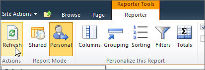
Click the Refresh button on the Reporter Tools ribbon to override the caching setting and display the most up-to-date content.
|
The captions (column titles) for all columns except the Web Name and List Name are specified in the report definition. If you would like to have a different title for Web Name in the displayed report, enter it here. This will not change the captions in the tool pane.
The captions (column titles) for all columns except the Web Name and List Name are specified in the report definition. If you would like to have a different title for List Name in the displayed report, enter it here. This will not change the captions in the tool pane.
Select how you want the links in reports to behave:
Never
Selecting Never means links will follow default SharePoint behavior and open list items in the same browser window as the report.
Each Time
Selecting Each Time means that list items will open in a new browser window every time.
Once Only
Selecting Once Only means that all list items will open in the same separate browser window.
Select how you want to display the report description:
None
Collapsed
Expanded
|
Note: |
For information on editing report descriptions, please click here. |
Select how you want to display error messages:
None
Collapsed
Expanded
|
Note: |
BrightWork Reporter error messages can be very useful for debugging purposes, if you are creating your own reports or adding lists to your sites. |
Select this if you would like to run a Report Profiler report.
BrightWork
This uses BrightWork Reporter to render the data
Microsoft Chart Control for .NET Framework
This uses the Microsoft Chart Control for .NET Framework to render the data
|
Note: |
If the Microsoft Chart Control for .NET Framework is not installed on the SharePoint server this option will not be available. |
Select a chart type - the available chart types depend on the provider selected:
BrightWork
Bar
Microsoft Chart Control for .NET Framework:
Area
Bar
Column
Doughnut
Line
Pie
Spline
Stacked Area
100% Stacked Area
Stacked Bar
100% Stacked Bar
Stacked Column
100% Stacked Column
Step Line
Select and define the columns that will be used to render the chart.
Column
Select the column to use as the X-Axis
Sort Direction
Select the direction in which you want the items returned to be sorted
Enable categorization for this column
Select whether you want all the list items returned to be grouped according to the values in the X-Axis column. Not selecting this checkbox means that list items returned will be individually displayed.
Do not include data when the Y-column values(s) equal zero
Select to exclude items with a Y-column value of zero
Display the number of items in this category
Select to display the number of items in a categorized X-Axis column
|
Note: |
This option is only available if categorization is enabled for the X-Axis column |
Column
Select the number column(s) to display along the Y-Axis
|
Note: |
For most chart types you can select up to 4 Y-Axis columns. The exception are for Pie and Doughnut. |
Formula
Select the formula to be used on the selected Y-Axis column data.
|
Note: |
This option is only available if categorization is enabled for the X-Axis column |
|
Function |
Description |
|
Average |
Calculates the average value for a column. |
|
Count |
Counts the number of items in a column. |
|
Maximum |
Returns the highest value. |
|
Minimum |
Returns the lowest value. |
|
Standard Deviation |
Measures how widely values are dispersed from an average value (a mean). |
|
Sum |
Adds the items in a column. |
|
Variance |
Measures the statistical variance of all values in the column. |
Chart Theme
By default, charts use the local SharePoint theme to designate a color scheme for the Y-Axis columns; however, you can over-ride this and select a custom theme for the chart.
|
Chart Theme |
Y-Axis Settings |
|||
|
Column 1 |
Column 2 |
Column 3 |
Column 4 |
|
|
Bright 1 |
|
|
|
|
|
Bright 2 |
|
|
|
|
|
Blue Scale |
|
|
|
|
|
Excel |
|
|
|
|
|
Grey scale |
|
|
|
|
|
Primary |
|
|
|
|
|
Traffic Light |
|
|
|
|
|
Note: |
If the chart type is Pie or Doughnut, the values in the selected X-Axis column will be illustrated. |
Chart Width
Specify a width for the chart
Chart Height
Specify a height for the chart
|
Note: |
Chart height and width settings of below 100px will be ignored. This setting does not apply to charts using the BrightWork provider. |
Show Chart Title
Select to enable the display of a chart title
Title
Enter a title for the chart
Location
Select the preferred location for the chart title
Alignment
Select the preferred alignment of the chart title
Show Chart Legend
Select to display a legend that illustrates the selected Y-Axis columns
Location
Select the preferred location for the chart legend
Alignment
Select the preferred alignment of the chart legend
Show data labels
Select to include in chart data results
You can match values in certain column types to a specific color, for example BrightWork includes a number of Red, Yellow, Green columns such as the Health Indictor. With this feature you can ensure that the colors displayed in a chart match these values.
To specify Custom X-Field styles:
|
Note: |
This feature is only available when:
|
|
Note: |
The following rules specific to each column type apply:
|
To modify the BrightWork Reporter web part's standard SharePoint settings:
Click 6 on the BWR web part toolbar and select Modify Shared Web part to open the web part tool pane.
Select the appropriate options (see below) and click OK.
The areas you can modify include:
| Property | Description |
|---|---|
| Title | Specifies the title of the Web Part that appears in the Web Part title bar. |
| Height | Specifies the height of the Web Part. |
| Width | Specifies the width of the Web Part. |
| Chrome State | Specifies whether the entire Web Part appears on the page when a user opens the Web Part Page. By default, the chrome state is set to Normal and the entire Web Part appears. Only the title bar appears when the state is set to Minimized. |
| Chrome Type | Specifies whether the title bar and border of the Web Part frame are displayed. |
| Property | Description | ||
|---|---|---|---|
| Hidden | Specifies whether the Web Part is visible when a user opens the Web Part Page. If the check box is selected, the Web Part is visible only when you are designing the page and has the suffix (Hidden) appended to the title.
You can hide a Web Part if you want to use it to provide data to another Web Part through a Web Part connection, but you don't want to display the Web Part. |
||
| Direction | Specifies the direction of the text in the Web Part content. For example, Arabic is a right-to-left language; English and most other European languages are left-to-right languages. This setting may not be available for all types of Web Parts. | ||
| Zone | Specifies the zone on the Web Part Page where the Web Part is located.
|
||
| Zone Index | Specifies the position of the Web Part in a zone when the zone contains more than one Web Part.
To specify the order, type a positive integer in the text box. If the Web Parts in the zone are ordered from top to bottom, a value of 1 means that the Web Part appears at the top of the zone. If the Web Parts in the zone are ordered from left to right, a value of 1 means that the Web Part appears on the left of the zone. For example, when you add a Web Part to an empty zone that is ordered from top to bottom, the Zone Index is 0. When you add a second Web Part to the bottom of the zone, its Zone Index is 1. To move the second Web Part to the top of the zone, type 0, and then type 1 for the first Web Part.
|
| Property | Description | ||
|---|---|---|---|
| Allow Minimize | Specifies whether the Web Part can be minimized. | ||
| Allow Close | Specifies whether the Web Part can be removed from the Web Part Page. | ||
| Allow Hide | Specifies whether the Web Part can be hidden. | ||
| Allow Zone Change | Specifies whether the Web Part can be moved to a different zone. | ||
| Allow Connections | Specifies whether the Web Part can participate in connections with other Web Parts. | ||
| Allow Editing in Personal View | Specifies whether the Web Part properties can be modified in a personal view. | ||
| Export Mode | Specifies the level of data that is permitted to be exported for this Web Part. Depending on your configuration, this setting may not be available. | ||
| Title URL | Specifies the URL of a file containing additional information about the Web Part. The file is displayed in a separate browser window when you click the Web Part title. | ||
| Description | Specifies the Screen Tip that appears when you rest the mouse pointer on the Web Part title or Web Part icon. The value of this property is used when you search for Web Parts by using the Search command on the Find Web Parts menu of the tool pane in the following Web Part galleries: Site, Virtual Server, and Web Part Page. | ||
| Help URL | Specifies the location of a file containing Help information about the Web Part. The Help information is displayed in a separate browser window when you click the Help command on the Web Part menu. | ||
| Help Mode | Specifies how a browser will display Help content for a Web Part.
Select one of the following:
|
||
| Catalog Icon Image URL | Specifies the location of a file containing an image to be used as the Web Part icon in the Web Part List. The image size must be 16 by 16 pixels. | ||
| Title Icon Image URL | Specifies the location of a file containing an image to be used in the Web Part title bar. The image size must be 16 by 16 pixels. | ||
| Import Error Message | Specifies a message that appears if there is a problem importing the Web Part. |